Assignment 8, Example 3
Usability Script
- Before showing the test subject our app, we explained the goal of the app in order to set up their context; we told them that they’ll be testing a coupon consolidator. After prepping them, we asked what they are expecting of this app as far as brand and feel.
- Ask them to sign the consent form.
- Present the user with a smartphone displaying our app’s homepage and allow them to look at the home page for approximately 5 seconds before the assigning of tasks.
- Assign tasks:
- Add a coupon to the wallet.
- Sort a coupon list by expiration date.
- Add 3 more coupons.
- Remove a coupon.
- Ask the user to determine how many coupons are in the wallet without prior knowledge.
- Ask the user to take a picture of an imaginary coupon and upload it.
- Generate the QR coupon.
- Conduct post test survey.
Things to keep an eye out for:
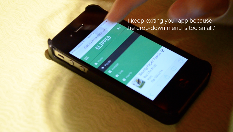
- How is the user interacting with the navbar?
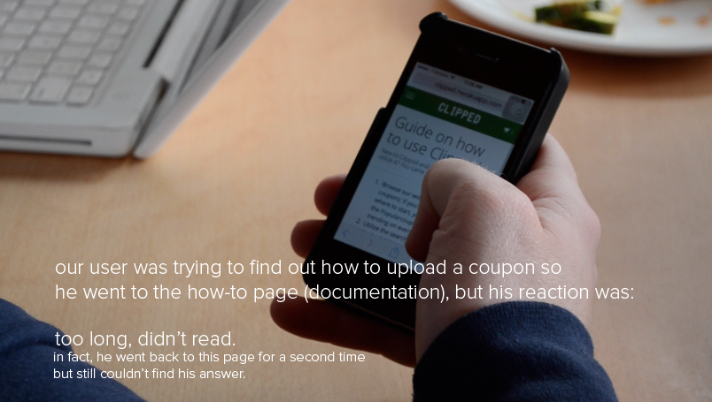
- Does the user use the how-to page at all?
- If so, how long do they spend on it?
- How often do they go back to the home page?
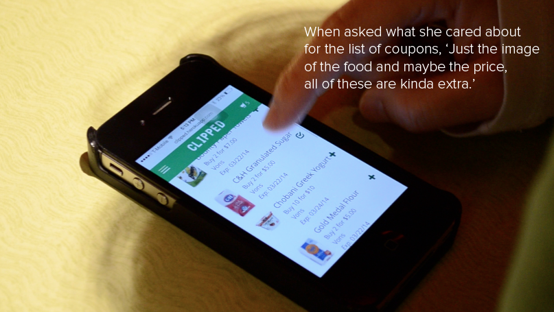
- What do they care about? What information helps them navigate?
- What do they not care about- what are some extraneous steps or information?
Consent forms were included here
List of Changes
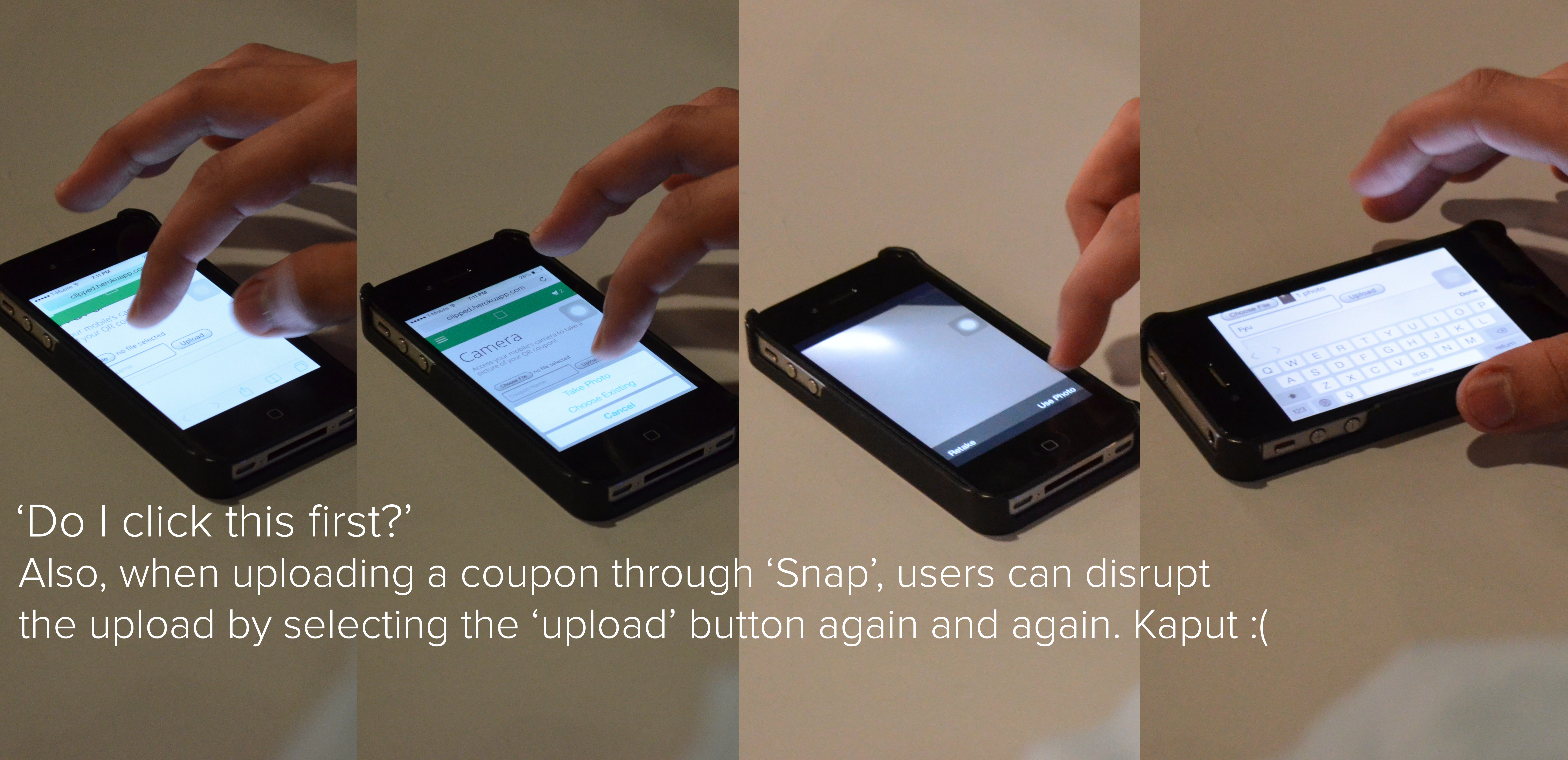
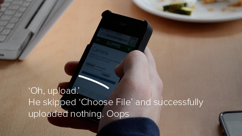
- Disable the upload button until the user chooses a file to upload. Currently the user can upload an empty file which caused confusion in our second user test.
- Add informational text or diagrams to the “Snap” page to make it more intuitive to use. Currently there are no instructions or diagrams and relies on the user to divine how to use the page. Some users were not able to do so and were not able to use the page.
- Shorten/condense the text on the “How To” page. A user visited the page to find specific information, and although that information was present, they were not able to quickly find it and instead moved elsewhere on the site in pursuit of the information.
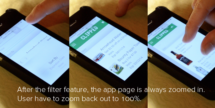
- Convert the drop down menu that handles coupon sort parameters to buttons. Users had to scroll or resize page when drop-down menu was used because it automatically zooms in slightly which cuts off information on the edges off the page. This creates more work for the user, and we might be able to fix this by creating buttons to represent the parameters.
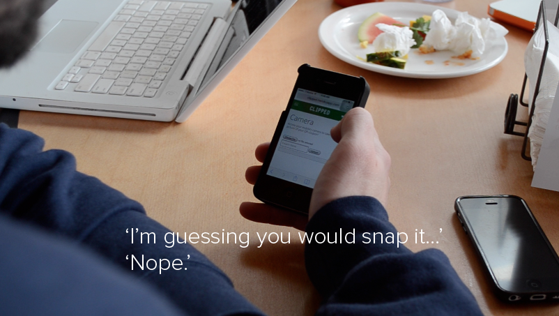
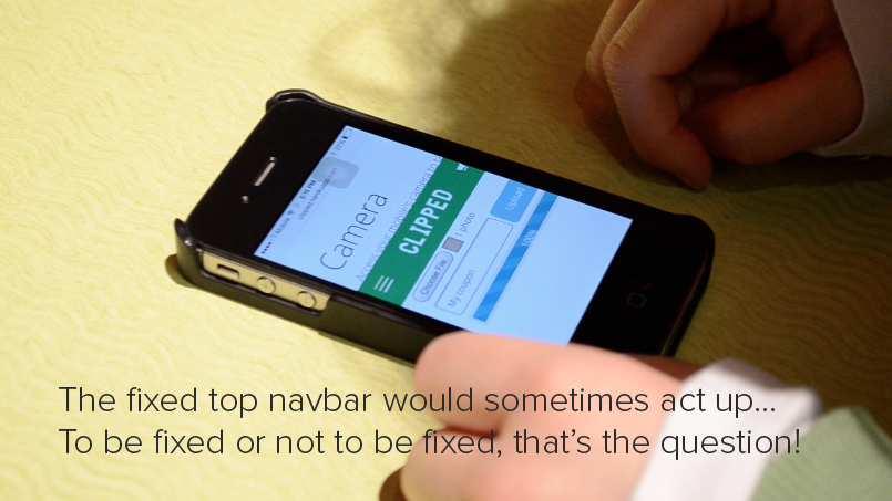
- Change the Choose File button’s text from choose file to Take Picture/Choose FIle. When the user was presented with the task to take a picture and upload it, the user did not use the choose file button. To make this button’s purpose clearer, we might change the text to indicate that this button leads to taking a picture as well as choosing a file.
- Change the arrangement of grocery coupons available so that instead of displaying all of the information with the image of the food item, images of coupons would be displayed to look more like a gallery wall. (If time permits because this is actually a very large redesign change)
Redesign
View the redesign here.
Note: The team submitted this as a functional, implemented redesign-- the video was made for archival purposes.
Description of Online Test
Experiment 1: Dropdown or Buttons (see user test 3)
While conducting in person testing, it became apparent that when the user interacted with the drop down bar that determined how coupons are sorted, the page zooms in after a sorting parameter is selected. This did not seem to bother the user, who immediately scrolled to find the information that was cut off when the page zoomed. While the user did not express frustration, we realize this is a single view point of a user who easily navigated the page. To a user who experiences difficulty navigating, this auto zoom byproduct might be a turnoff. To determine if this zoom effect is problematic, we need to increase the sample size in order to get more data, and we will do so by turning to online testing. This testing will be conducted in A/B fashion, with the A design being our original interface (the sort functionality being placed within a dropdown menu). The B design will incorporate changes to the interface by which users select coupons sorting parameters through a series of adjacent buttons. These buttons allow for the user to see all options simultaneously while still being able to see the list of coupons, it would negate the zoom factor caused by the drop down, and if we are able to find suitable imagery to represent the sort parameters, it will promote recognition over recall. We hope that this user testing will enable us to determine the superior, and more intuitive way to display sorting parameters by inquiring as to which design the user preferred, and asking about any frustrations or annoyances faced using either one. Additionally, if images or graphics are used in the buttons to represent the parameters, we will also be looking for confusion on the part of the user when interacting with the buttons.
Experiment 2: Snap page - Instructions or no instructions
While conducting in person test, we found that one user found the snap page difficult to use. Specifically, when given the task “upload a coupon”, the user was not sure how to proceed once on the snap page. From there the user navigated to the “How To” page, skimmed the text, did not immediately find the information they needed, and then proceeded to navigate around aimlessly. We fear that this user’s experience is not unique and is indicative of the experience that many others will have. We plan on redesigning the “Snap” page to include information that instructs the user how to operate the page. This hopefully reduces the confusion that the “Snap” page causes. In the A/B testing, the A test will consist of the original design. The “Snap” page will not have any explanations on how to use the page. The B test will hold informational text, or diagrams to help the user understand the page’s functionality. Ideally, the results of the testing will be made apparent by the ratio of how many people successfully upload a coupon to the page quickly and efficiently between the two tests.
